Introduction
After more than a year of groundwork, the first full production report was finally delivered to the operations team on one of our projects. What made it significant wasn’t the layout or the chart design, but the fact that it could be built without engineering support, and without relying on unstable, frontend-based logic.
Until that point, reporting had been slow and inconsistent. Different teams used different metrics, and any change required help from developers. The company had outgrown manual dashboards, but the infrastructure behind them hadn’t kept up. This project set out to change that by building a proper analytics foundation from scratch.
However, the real achievement was the system that powered it. After months of designing the data model, validating inputs, and migrating everything from a dynamic MongoDB source to a structured analytics warehouse, the actual report took just one week to create. That timeline shift – from months of cleanup to days of insight – was the clearest sign that the new pipeline was doing exactly what it was meant to do.

The business need: one question, many answers
As companies grow, so do the gaps in how teams define success. Marketing looks at product trends and top sellers. Growth teams focus on upsells and margin. Operations might care about reservation patterns or cancellations. Everyone is asking valid questions, but often with different definitions and datasets behind them.
That was the core problem: no shared understanding of how to measure performance. Reporting was fragmented, and the answers people got depended entirely on where they looked and who they asked. For leadership trying to understand the bigger picture, it created friction, not clarity.
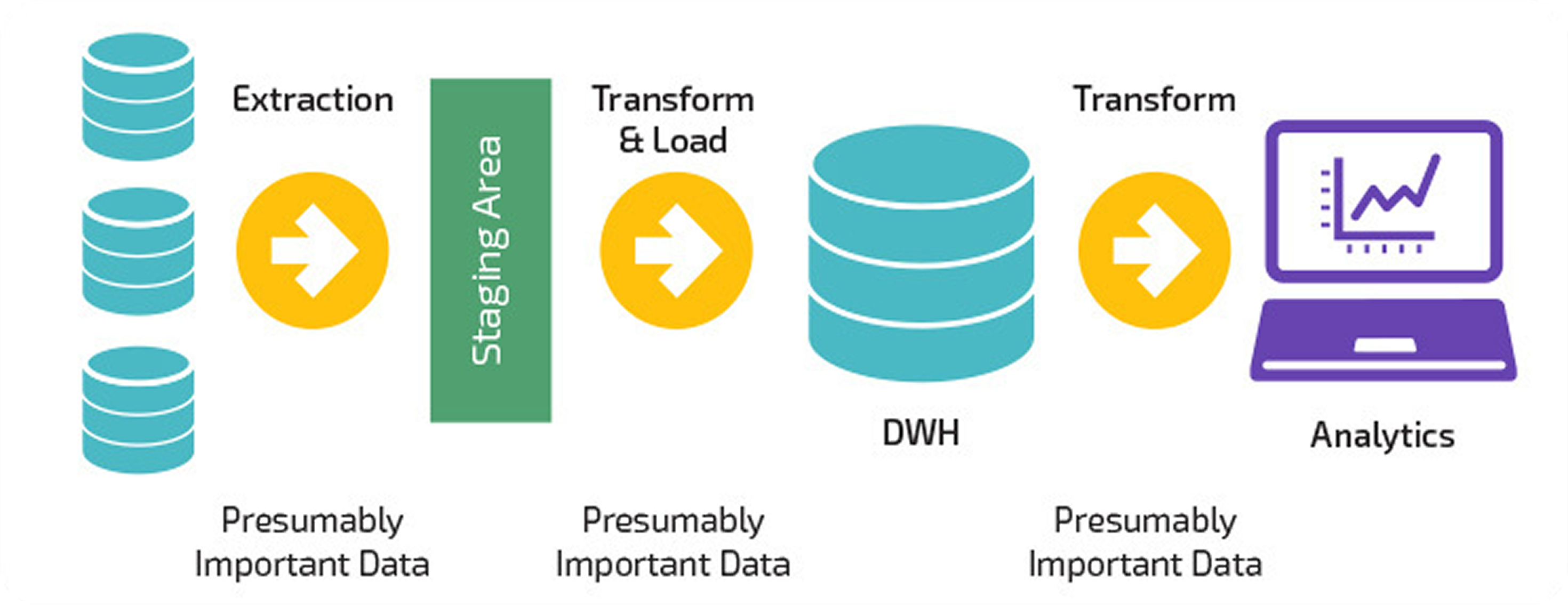
The only way to fix this was to create a single source of truth that could serve all departments. That meant taking reporting out of the app’s primary database and moving it into a system built specifically for analytics. Not just for faster dashboards, but for long-term alignment on what the data actually means. This shift laid the groundwork for reliable metrics, faster insight, and eventually, self-serve reporting at scale.
How the pipeline was built
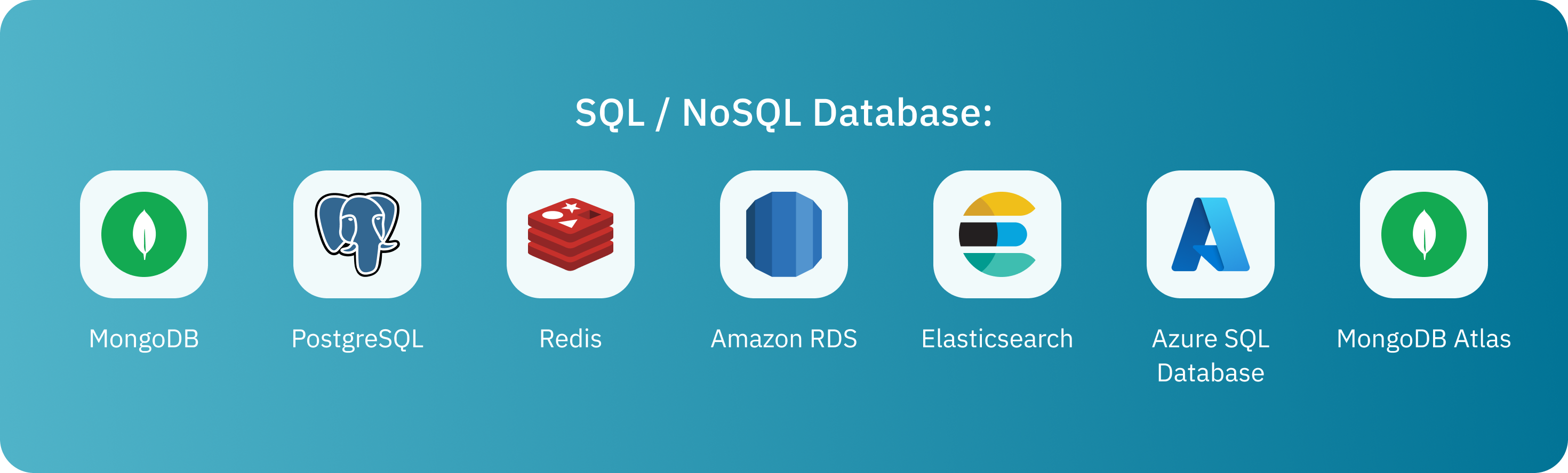
The source database was MongoDB: flexible, but unpredictable. With no enforced schema, rows in the same collection could have entirely different fields. This flexibility worked for the application, but at the same time it made analytics slow, manual, and error-prone.
The first step was understanding the business logic behind the data. That meant mapping out the full flow: how bookings were made, how payments and cancellations worked, and how operations wanted to query this information. Without that clarity, there was no point in writing transformations.
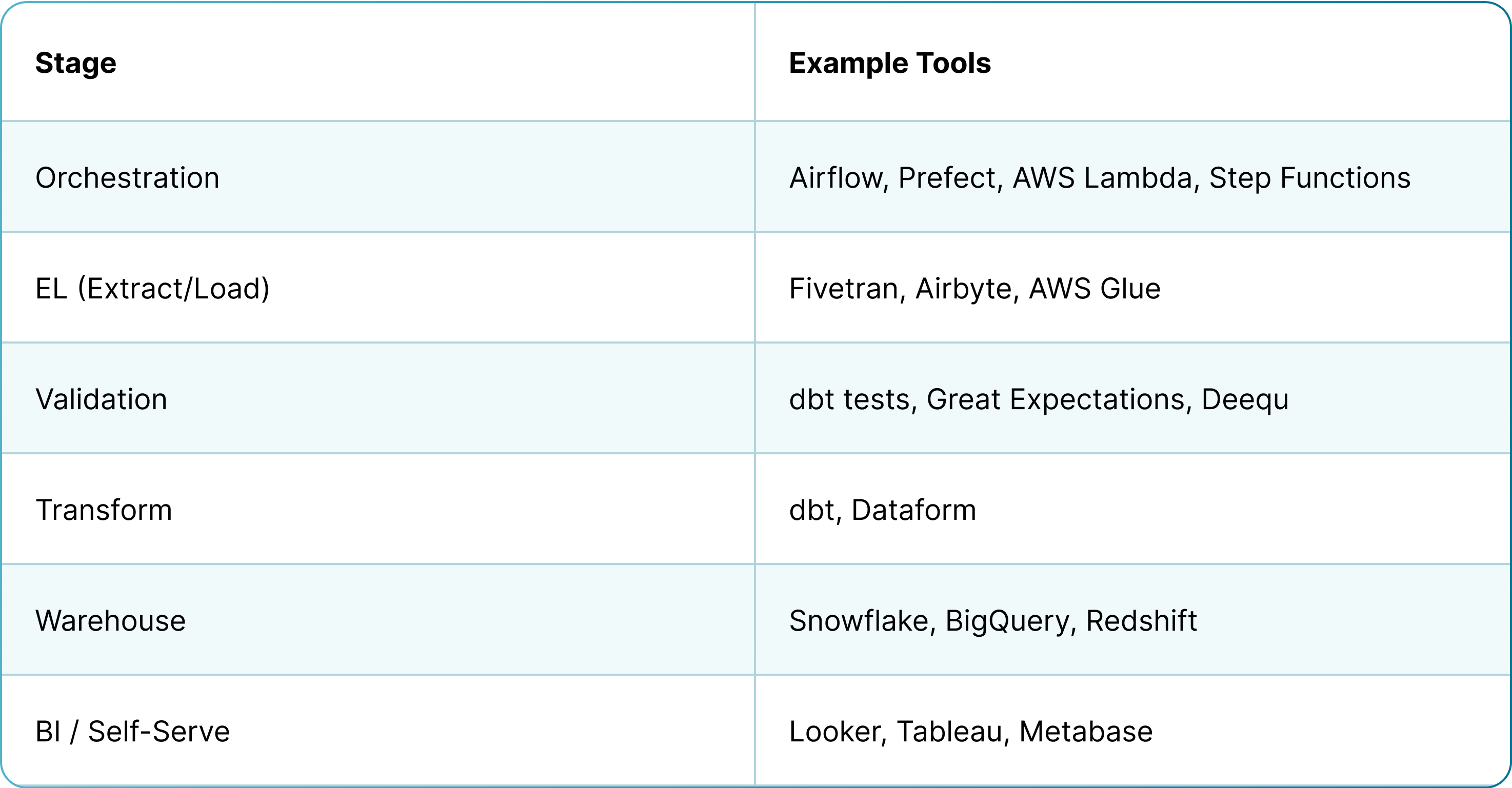
The team moved the data into a structured warehouse using a carefully designed ELT pipeline. Tools like Fivetran and AWS Glue helped extract and load the data. From there, dbt handled the transformations, joining and cleaning the tables into analytics-ready formats. Validation rules were built in early, ensuring bad rows didn’t break the pipeline. To keep everything aligned, a shared data dictionary documented every metric, every column, and how each should be interpreted. Instead of building a dashboard, it was about building infrastructure that made dashboards easy to trust.
What changed for the business
Before the pipeline, even a small dashboard change meant waiting on engineers. After the pipeline, building the first report took one person a week. The system not only just delivered data faster, it shifted who could access and work with it too.
Instead of relying on developers or analysts to fetch data, operations teams could use a BI tool to explore metrics on their own. Tables were curated and labeled with definitions. Even without a technical background, users could look up revenue, reservations, or cancellations and know exactly what they were seeing.
Keep it mind that the change wasn’t in the interface – it was in the workflow. Questions that used to require two meetings and a custom query could now be answered in minutes. The reporting layer no longer depended on code. It depended on structure.
Lessons from the process
Building the pipelines took over a year. The report took a week. That gap explains the value of doing things right the first time.
Achieving the clarity was more difficult than the code. In this project, delays weren’t caused by infrastructure, but by alignment. The data team often worked with engineers who didn’t always know what operations needed. Progress accelerated only when the right people – those who would actually use the reports – joined the conversation and clarified their goals.
The lesson is simple: a good pipeline starts with good communication. Defining terms, confirming logic, and getting validation early saved months of rework later. Another key: using ELT over ETL. By extracting raw data before transforming it, the team retained full flexibility to revisit decisions without pulling from the source again.
Most importantly, the team didn’t chase perfect tools, they focused on repeatable, understandable processes. That’s what made the outcome sustainable.
A foundation that scales
With the pipeline in place, reporting is no longer a bottleneck. It’s a resource. New dashboards can be built quickly, data scientists can work without preprocessing the data themselves, and leadership can explore metrics and KPIs without translation layers.
This is the real value of a proper analytics pipeline. It’s not just about dashboards anymore, it’s about building a foundation that outlasts the first use case. One that grows with the business, supports machine learning, simplifies audits, and keeps everyone aligned on what the numbers mean.