Introduction
When it comes to booking platforms—whether for facilities, coworking spaces, events, or travel—the difference between a completed reservation and a lost user often comes down to design. Over time, we’ve learned that a seamless user experience doesn’t just improve satisfaction; it directly impacts conversion.
At Ralabs, we’ve worked with a variety of booking solutions and gained valuable insight into what really works—beyond theory. Let’s look at the booking UX practices that consistently deliver results – based on real user behavior, tools like FullStory, and changes we’ve tested in live products.
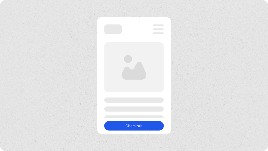
Start with a clear first step
The booking journey should begin without confusion. We’ve seen users arrive on a page only to scroll in search of the next step. One small change—placing the CTA above the fold—led to increased engagement with the first step of the funnel. In another case, after making the CTA button on the checkout page sticky, we observed a 4.17% increase in conversion, highlighting how micro-adjustments in visibility and placement can significantly impact user action.
What helps: Use a sticky or prominent CTA, clean page layout, and progress indicators if your flow spans multiple steps.
Tip: Use heatmaps or FullStory funnels to see where users click or where they drop off early.
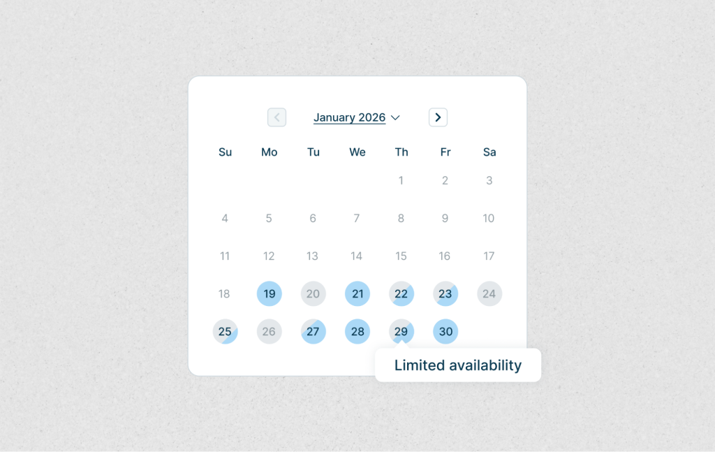
Make availability obvious
One pain point we often see: users trying to select times or dates that are already taken. It sounds small, but the frustration adds up since most users expect immediate feedback on availability. In one case, adding tooltips to explain unavailable slots and suggesting the next available time led to a visible drop in rage clicks.
What helps: Gray out unavailable slots, show tooltips, and give fallback suggestions.
Tip: Watch for repeated or rage clicks in FullStory session replays—often a sign your availability UI needs work.
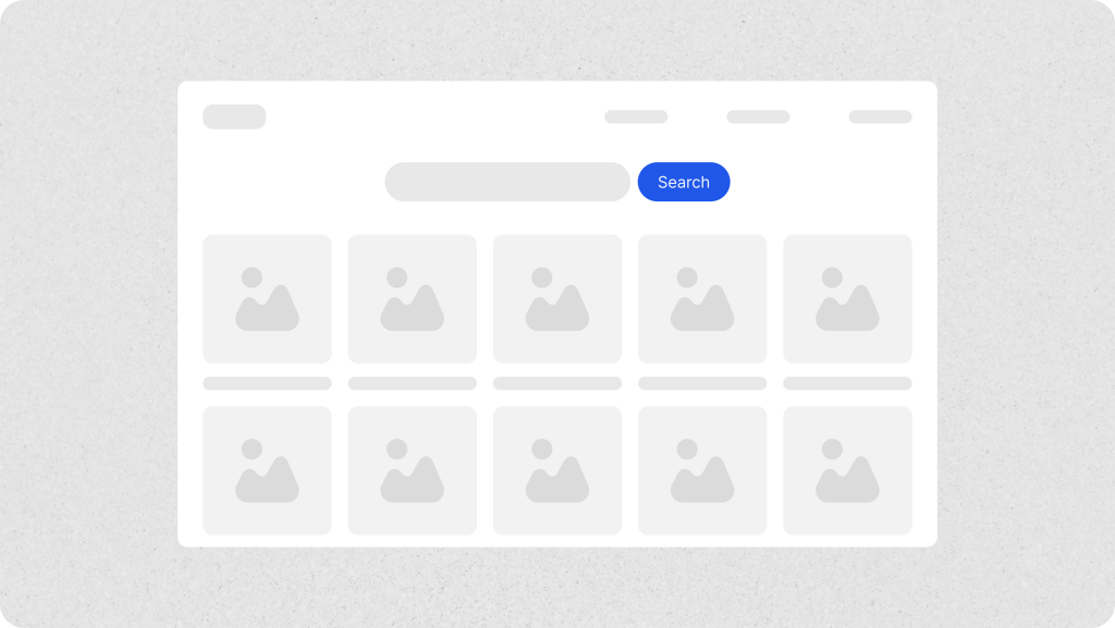
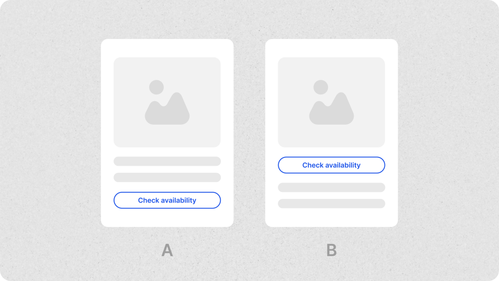
Let the content speak for itself
Good visuals and smart descriptions can do more than your CTA ever could. Listings with high-quality photos and clear descriptions build trust and reduce hesitation. When we improved visuals and added concise, benefit-focused descriptions to several listings, we saw improved engagement and scroll depth
What helps: Bright images, social proof (like ratings), and descriptions that emphasize why it’s a good choice—not just what’s included.
Tip: Use heatmaps to check how far users scroll, and which sections get skipped entirely.
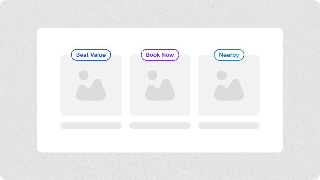
Reduce cognitive load with defaults
In one of our internal flows, drop-offs were common at the time selection stage. We added smart defaults — pre-selected durations, highlighted popular options — and noticed task completion rates go up.
What helps: Labels like “Best Value” or “Nearby”, highlight recommended options, default time ranges, and consistent logic behind pre-fills.
Tip: A/B test with and without defaults to measure behavioral changes.
Be upfront about pricing
A sudden fee at the end can break trust. In one case, we added an expandable “Price Breakdown” just before checkout. Even though the total didn’t change, drop-offs at the payment step decreased slightly.
What helps: Show the full price early, explain what’s included, and make refund policies clear.
Tip: Hover patterns and exit pages in FullStory will show you if users are confused near the price.
Design mobile-first, not mobile-second
Mobile is where the majority of users are — but it’s still where many booking flows break. We’ve seen time and again that sticky CTAs, larger touch targets, and mobile-first layouts improve usability dramatically.
What helps: Sticky buttons, auto-filled fields, fast page loads.
Tip: Segment mobile users and compare funnel performance to desktop users. You’ll likely uncover overlooked friction.
Help users recover from mistakes
Nobody likes filling in a long form twice. We improved one booking flow just by adding clearer error messages and allowing users to edit inputs without resetting everything. Form completion went up, and frustration went down.
What helps: Inline validation, edit-friendly flows, and specific error messages.
Tip: Rage clicks and exits during form steps are red flags—watch sessions and look for patterns.
Make it accessible to everyone
Inclusive design improves usability for all users, not just those with accessibility needs. Adding filters like “wheelchair accessible” and ensuring proper contrast and keyboard navigation helps more people complete bookings.
What helps: Alt text, keyboard support, readable contrast, and inclusive filters.
Tip: Run automated audits with tools like Lighthouse or Axe, then test with real users when possible.
Iterate, don’t assume
One of the best things we’ve done is embrace iteration. Using tools like FullStory, we continuously test small improvements—CTA labels, layout adjustments, field defaults—and monitor how they influence behavior.
What helps: Funnel tracking, A/B tests, usability testing, and constant small experiments.
Tip: Don’t wait for major redesigns. Small, well-informed tweaks can drive real growth.
Final thoughts
Booking UX is all about reducing uncertainty and making action feel effortless. Clear direction, helpful content, transparent pricing, and mobile-first design all contribute — but above all, so does listening to users.
Whether you’re designing a hotel platform, a room reservation app, or a venue booking marketplace, these principles will help your users move from “maybe later” to “booked.”
And if you’re already applying these ideas? Great—now it’s time to refine, test, and go even further.