Introduction
You’re reviewing a redesign. Could be an agency pitching for the work, could be the first build from your own team, could be a product you’re about to acquire. The screen loads clean: a hero or a header, a row of cards with icons in rounded tiles, generous spacing, a palette that reads as considered.
It also looks like the last four things you were shown this month, and you couldn’t attribute that palette to any of them.
The instinct is to ask whether AI made it. Wrong question. You can’t answer it from a screenshot, and the answer wouldn’t change your decision if you could. Designers have shipped conventional card grids for a decade, and generated work can be careful and specific when someone gives it direction.
Here’s the question that pays: did anyone decide anything here, or did someone accept the defaults and ship?
Four questions get you to an answer. The sections below are the evidence you need to answer them.
- What does this screen want someone to do, and is that the most important thing available?
- Which choices here are specific to this product, and which would work unchanged on someone else’s?
- Has anyone opened every state, or only the one in the demo?
- Who is accountable for the decisions, and who reviewed the implementation?
The first screen is the cheapest part of a product to make impressive and the least informative about everything behind it.
What AI design slop is
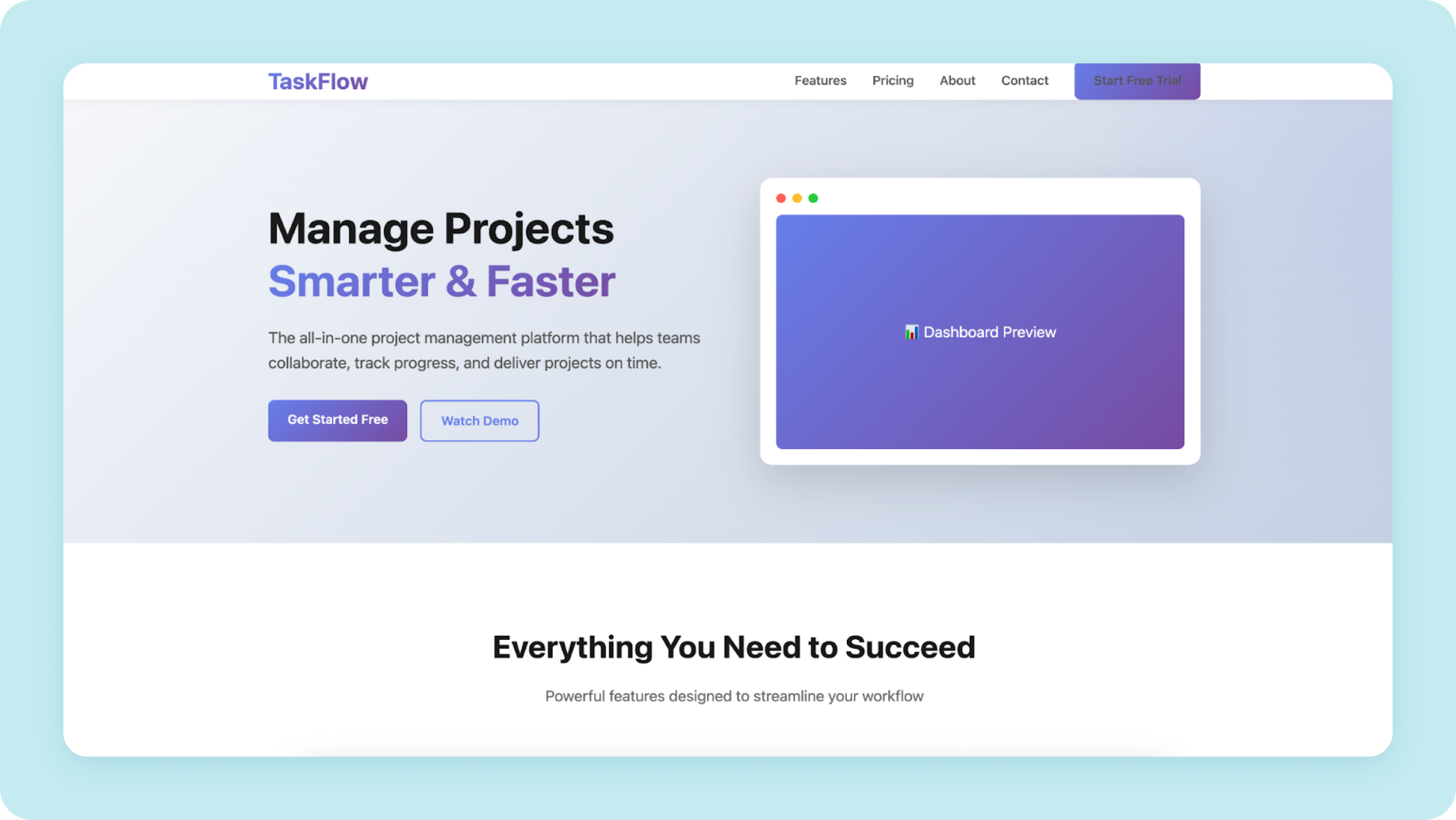
AI design slop is interface work that is competent and interchangeable. Nothing is broken, and nothing was chosen. It happens when a generation step runs without a brief, so the output lands on the statistical average of the interfaces the model learned from. The cause is a missing decision, not a bad tool.
Anthropic’s Applied AI team named the mechanism in a November 2025 post on improving Claude’s frontend design through Skills: distributional convergence. During sampling, models predict tokens from statistical patterns in training data. Safe choices that work universally and offend nobody dominate that data, so without direction the output lands in the high-probability centre.
An average of every interface ever built is not a style. It’s the absence of one. Which is also why the adjectives people reach for to fix it (modern, clean, minimal) change nothing. Those words are already inside the average.
Two things get collapsed into one here, constantly. Generic output is a brief problem, not a tooling problem, and a vague brief produces averaged results whoever executes it: a designer, v0, Cursor or Claude Code. And the ingredients aren’t faults. Inter is a good screen typeface. Cards, rounded corners, and standard icon sets solve real problems. These defaults come from what the training data rewarded, not from a ceiling on what the tools can do.
There is also no detector that settles this for you. Tools exist that scan frontend code for common defaults such as Inter, and they are useful for exactly that. They flag patterns, not provenance, and they cannot tell you whether the pattern was chosen. A structured review answers the question those tools stand in for.
What has changed is volume. When a finished-looking screen costs an afternoon in v0, Lovable or Claude Code instead of a fortnight in Figma, the number of them goes up while the thought behind the average one goes down. Nothing forces a decision anymore. Polish used to be evidence that someone spent time on something, and it isn’t, which is the whole reason a buyer now needs a different way to look.
What changes once there is real software behind the screen
A shipped product exposes four problems a marketing page never shows: data that doesn’t fit the layout, components repeated across dozens of screens, people who use the product every day, and drift between design and code.
Almost everything written about this subject uses marketing pages as its evidence. That’s the easy case, and it’s worth saying plainly, because a page is a single screen with no data, no permissions, no history, and no second visit.
Read the tells in the sections that follow with these four in mind, because each one costs more inside a product than on a page.
Data doesn’t behave. Every generated interface is designed around content of a convenient length. Real names run to forty characters. Real tables have two rows or eleven thousand. Real numbers are negative sometimes. A layout that only holds together at demo dimensions isn’t finished, it’s staged.
The same component appears on thirty screens. A button that looks good once has to look right everywhere, in every state, at every size, next to every other component. This is what a design system is for, and why design tokens exist: a colour, a spacing step or a type size defined once and referenced everywhere, so a change propagates instead of drifting. Consistency at this scale is not a visual preference. It’s the thing that lets someone learn the product once instead of relearning it per screen. Generated work assembles each screen in isolation, which is exactly the condition under which consistency quietly erodes.
Nothing is a first impression twice. Products are used by the same person repeatedly, which inverts most of the aesthetic calculus. Delight on visit one is friction by visit twenty. Speed, predictability and boring consistency win over character in almost every internal tool ever built.
Design and implementation drift apart. What was designed and what shipped diverge under pressure, and the gap is invisible unless someone goes looking. We found the same pattern when we tested Figma’s Dev Mode MCP server with Cursor on a Figma-to-Vue conversion. Setup took under thirty minutes and the toolchain saved 10–15% of frontend time on standard design-to-code work, which is a real result. It also needed manual correction on output even for small components, and the fixes were the same three every time: incorrect layering, incomplete styles, and missing interaction states like hover and active. Accuracy depended entirely on linking specific components in Dev Mode. Without those links, the model inferred structure and produced hallucinated output.
Typography and colour tells in AI-generated design: examples
The most reliable typography and colour tell in AI-generated design is a treatment that would sit unchanged on any other product.
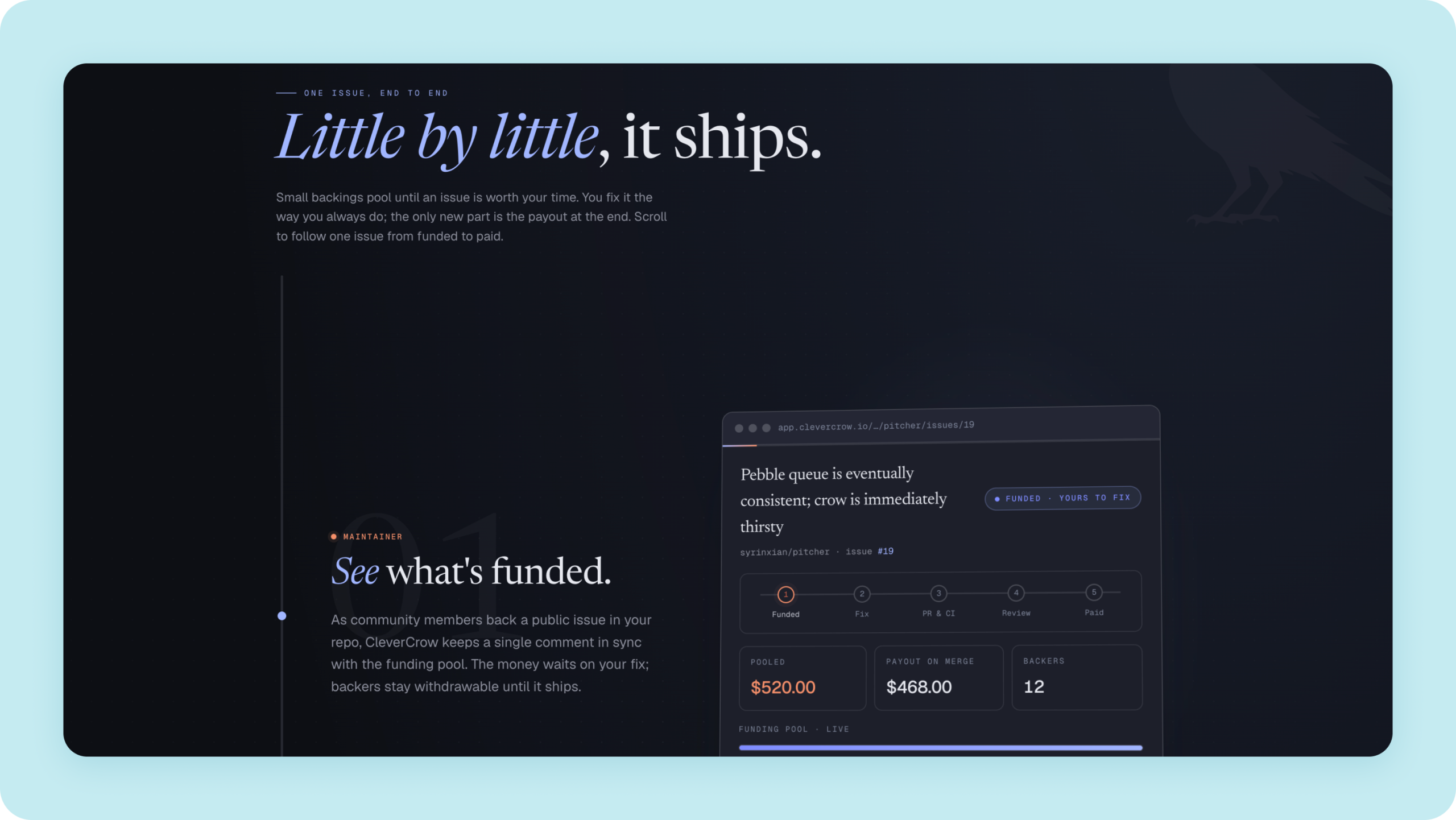
The tells move, which is worth knowing before you rely on any of them. The purple-to-blue gradient that defined generated interfaces a year ago has largely receded. What replaced it is a particular kind of serif (like Instrument Serif) in the heading, a formal display face standing in for “elegant,” now appearing on products that have nothing formal about them.
The durable question underneath the moving list is whether the typography says anything about this product. Put the screen next to a CRM, a clinic booking tool and a crypto exchange. If the same treatment sits comfortably on all four, nobody chose anything. They accepted something.
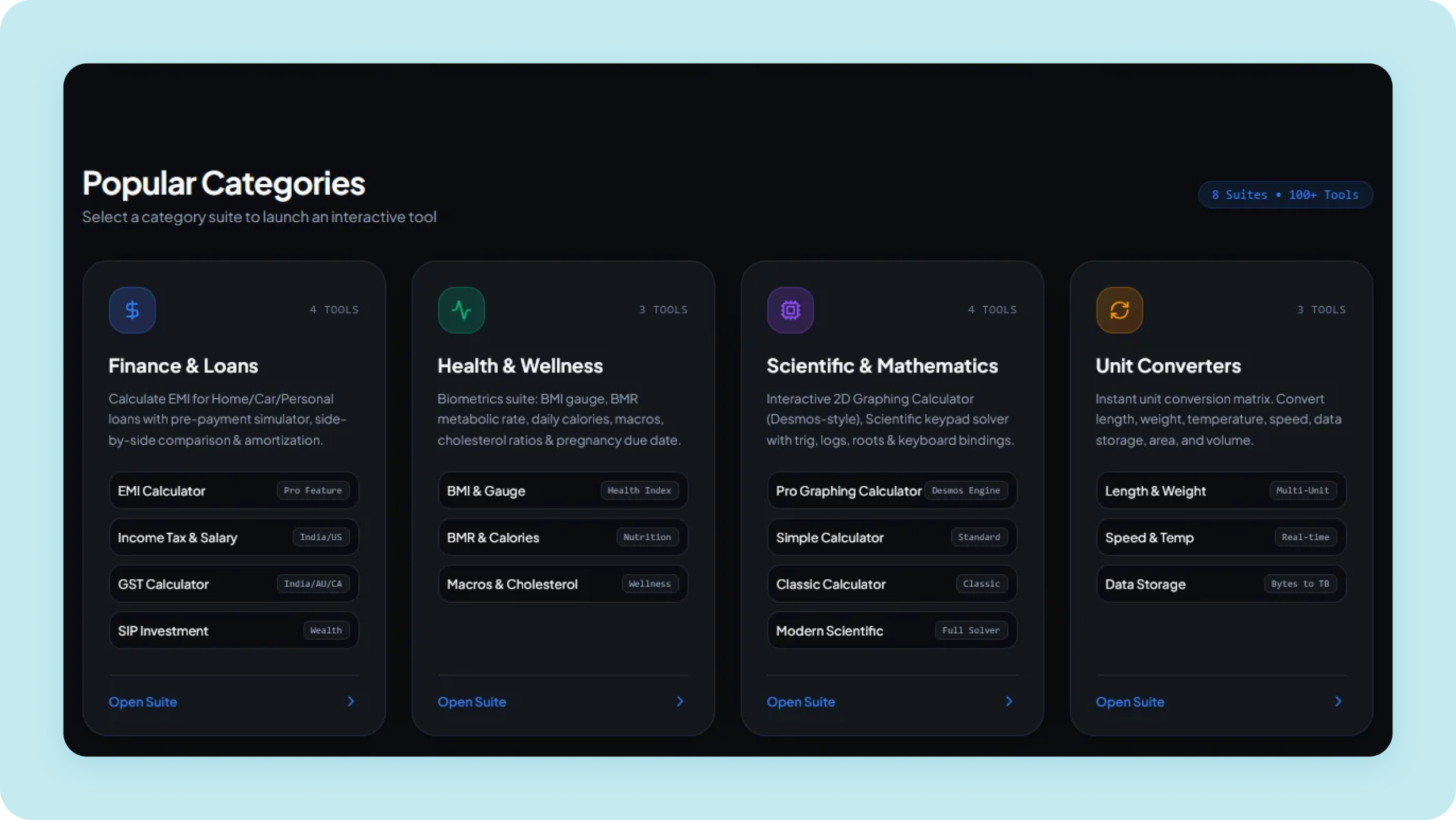
Colour has a second failure that’s easier to spot once named. Everything sits in the same register. A cyan icon inside a pale blue tile, inside a card in another blue, edged with a translucent border in a third. Nothing clashes and nothing separates either. A working palette is mostly neutral, with a smaller supporting range and a genuinely small amount of accent doing the pointing.
In an application this stops being a matter of taste. If four colours are competing, none of them can carry a meaning, and you lose the ability to say this is destructive, this needs attention, this is the primary action without spelling it out in words.
Decoration that carries no information
Decorative effects in AI-generated interfaces usually fail one test: whether they carry information.
An icon in a rounded tile, in a colour one step off its background, above every heading. Emoji used as illustration. A frosted-glass panel over a gradient with a one-pixel light border. A gradient running through a headline. A drop shadow under a button that wasn’t floating above anything.
Every one of these effects has a legitimate use somewhere. Glass is a real device for putting one layer over another. It is not a reason to put one layer over another. Icons earn their place on things you click, far less on things you read.
The cost scales with use. On a marketing page an unnecessary flourish is seen once. In a product it’s seen forty times a day by someone trying to get work done, and what reads as characterful on first visit reads as noise by the second week. Frosted panels over busy backgrounds hurt legibility. Shadows applied by default put elements on a layer they don’t belong on, quietly claiming one thing sits above another when it doesn’t.
Visual hierarchy: containers standing in for decisions
A screen with a working hierarchy is legible at a glance, before you read a word. You know where to look first and where next, and that comes from ordinary things: size, weight, spacing, how quiet the secondary text is allowed to be.
Generated layouts reach for containers instead, because a border is easier to add than a decision about what matters. Cards inside cards. A bordered box holding one line of supporting text that didn’t need a box. A panel wrapped in a panel. Each container was added to make something feel deliberate, and the accumulated effect is that nothing is emphasised, because everything is.
Dashboards suffer worst. Twelve metric cards of equal visual weight is not a dashboard, it’s a list. Someone has to decide which two numbers a person opens this screen to see.
Interface states nobody opened: empty, loading, error, permission
Empty, loading, error and permission states are where AI-generated interfaces most often fail, and none of them appear in a screenshot or a demo.
Hover effects pulling in two directions at once, a card lifting while its image grows. Entrance animations slow enough to be tiring on the second visit. And the failure worth separating from every taste question: content that never appears at all, because its entrance animation was tied to a scroll position that didn’t fire. That isn’t a stylistic disagreement. That’s a blank section on someone’s screen.
In a product the list is much longer and mostly invisible in a demo. Five states are worth opening before anything else:
- Empty state, before any data exists
- Loading state, including the slow case
- Partial failure, where three of four panels returned
- Permission denied, for a user who lacks access
- Validation error, on a form someone filled in wrong
These are the screens users actually spend anxious time on, and they are the first thing skipped when an interface is generated from a description of the happy path.
Layout artifacts sit here too. A coloured bar down the left edge of a card that squares off the corner it meets, because a left border and a rounded corner were applied to the same container. Nobody chose that. It’s a leftover.
Interface copy and microcopy that could describe any product

Interface copy is design work, and it’s the half teams skip even when they fix the visuals.
On a marketing page: aspirational headlines that average every headline the model has read, four pieces of microcopy explaining one field, a stats bar with no source. Testimonials carry their own tell, a first name with a trailing initial, no face, no company. The section exists because pages have one, not because those quotes were needed.
Inside a product the same problem wears different clothes. Buttons labelled Submit and Continue where the actual action has a name. Error messages that report that something went wrong without saying what or what to do next. Empty states that say “No items” and nothing else, at exactly the moment a new user most needs a sentence of help.
Accessibility failures that carry legal risk
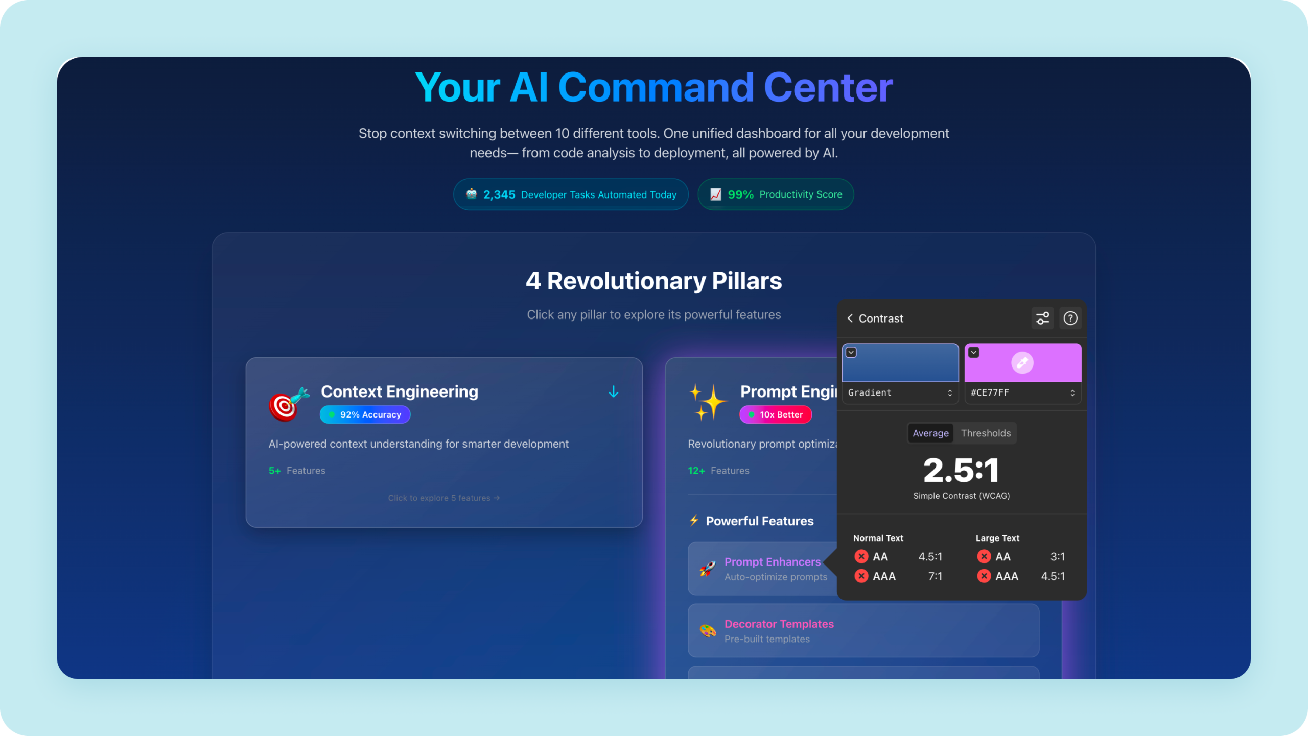
Accessibility is where design tells carry the most direct legal consequences. Since 28 June 2025, the European Accessibility Act (EAA) has required products and services in its scope to be accessible, however they were produced.
The scope is specific. It covers consumer-facing services such as e-commerce, banking, e-books, telecoms and transport ticketing. Microenterprises providing services are exempt, and many internal B2B tools fall outside it.
The benchmark is the harmonised standard EN 301 549. The version in force today references WCAG 2.1 AA. Version 4.1.1, published on 2 September 2026, moves the standard to WCAG 2.2. It is expected to be cited in the EU Official Journal around 30 November 2026, at which point it becomes the version that confers presumption of conformity. Build to WCAG 2.2 AA now.
The failures we find most often in generated interfaces:
- Text contrast below 4.5:1, or 3:1 for large text (1.4.3)
- Icons, input borders and focus rings below 3:1 against their background (1.4.11)
- Controls that can’t be reached with a keyboard, or focus outlines removed for looks (2.1.1, 2.4.7)
- Layouts that break at 320 pixels wide or at 200% zoom (1.4.10, 1.4.4)
- Tap targets smaller than 24 by 24 pixels (2.5.8, new in WCAG 2.2)
Our guide to European Accessibility Act compliance covers scope, deadlines, and what ignoring it costs.
If you’d rather have it checked than check it yourself, our design team runs WCAG usability and accessibility testing, including sessions with people using assistive technology.
Where design judgment actually sits: before and after the prompt
Design judgment sits before the prompt, in deciding what a screen is for, and after it, in reviewing what was built.
Before: deciding what the screen is for. In a recent confirmation-page redesign for a facility management platform, we wrote the hypothesis down before touching the design, so every decision had to answer something concrete rather than “looks cleaner.” Surfacing the buried navigation moved clicks into request management from 5.6% to 29.7%, cut bounce from 59% to 36%, and took task time from 51 seconds to 30. One action moved the wrong way, and that’s the part worth noticing: comment reach fell from 24% to 9%, and it took three more weeks of measurement to work out that half of it was a flaw in how we were counting rather than a flaw in the design. No generation step gives you that.
During: giving the work direction specific enough to execute against, and catching the moment a plausible-looking result has quietly answered a different question than the one you asked.
After: reviewing the implementation, not the impression. Component and state consistency across screens. Responsive behaviour at the breakpoints your analytics actually show, not the three in the framework default. Contrast and keyboard access. Whether what shipped matches what was designed. A good share of this cannot be automated at all, because the finding depends on a judgment about the design and what it was for.
Our designers use AI across most of this: generating assets, building quick prototypes, running agents in Figma through repetitive work. What stays constant is that a person sets the final composition, style and tone, and that a fast concept a client built themselves gets brought up to production quality rather than shipped as-is. Speed and judgment aren’t competing. One makes room for the other.
The same division holds after launch. A design system only stays consistent if someone maintains it as the product grows, and drift between design and shipped code is a maintenance problem before it is an aesthetic one.
Four questions to ask in any design review
Stop asking whether an interface looks AI-generated. You can’t answer it reliably, and the answer wouldn’t change what you should do next. Ask these instead, and listen for the kind of answer that follows each one.
- What does this screen want someone to do, and is that the most important thing available?
A good answer names one task and one user, and explains why everything else on the screen is quieter.
- Which choices here are specific to this product, and which would work unchanged on someone else’s?
A good answer points to type, colour or layout decisions and says what about this product made them right.
- Has anyone opened every state, or only the one in the demo?
A good answer comes with screens: empty, loading, partial failure, permission denied and validation error, not a promise to handle them later.
- Who is accountable for the decisions, and who reviewed the implementation?
A good answer names a person for each, and describes how shipped code gets checked against the design.
A team that can answer those is worth working with, whatever they used to get there. A team that can’t is a risk, whatever they used to get there.
None of these questions are about tools, and that’s the point. Interfaces have always been averaged when nobody decided anything. Generation just made it cheap enough to happen at volume, on a schedule, without anyone noticing. Which means the thing you’re actually buying hasn’t changed. You’re buying whether someone looked at the screen and asked what it was for.

Send us a screen or flow. We’ll answer the four questions in writing, including what we’d leave as is.
at Ralabs