
Introduction
Most teams treat the journey as finished the moment the main conversion happens. Someone submits a request, places an order, completes a booking, and the product returns a confirmation screen. Reference number, a couple of links, done.
In a simple product, that’s a fair call. In a complex one, it rarely is. The confirmation screen usually lands right when users still have live questions. What happens next? Where do I manage this? Do I need to upload anything? Can I add a comment or book something else without losing my place?
If that moment isn’t designed for, people navigate away to hunt for the next step, or drop the flow entirely, right after doing the most valuable thing the product asks of them. That was the opportunity in a recent confirmation-page redesign we ran for a facility management platform we work with. We didn’t treat it as a visual cleanup. We treated it as a product design problem, with a hypothesis and a measurement plan attached.
The setup: the main action was done, the journey wasn't
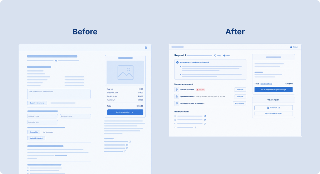
The screen sat at the end of a reservation flow. Once a user finished booking, they landed on a page that confirmed the reservation but did little to support what came next.
Different users needed different things. Some wanted to manage the request. Some needed to upload documents. Some wanted to leave a comment, browse other facilities, or just confirm everything had gone through.
The old version made all of it harder than necessary. Input fields sat permanently on the page, making it long and heavy. A full fee breakdown stayed visible even though users had already reviewed pricing at checkout. And the next steps people actually wanted were buried in a dropdown.
The layout needed simplifying, but the real problem ran deeper. The page tried to do five things at once with no sense of which mattered most in that moment.
The hypothesis
We wrote the hypothesis down before touching the design. If we cut the visual noise, defer secondary actions until people need them, and surface the most relevant next steps, users will complete post-booking tasks with less friction and move through the product with more confidence.
Writing it down kept us honest. Every decision had to answer something concrete rather than “looks cleaner.” Does this reduce cognitive load? Does it make the next step obvious? Does it protect the trust we earned at checkout? And can we measure whether it worked?
Decision 1: don't show everything by default
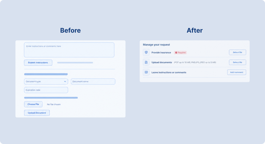
The old page exposed every input field up front, document upload and comment box included, all the time.
None of those actions were useless. They just weren’t relevant to everyone at once. Showing them by default meant every visitor paid the visual cost, including the majority who had no intention of uploading a file or leaving a comment.
So we deferred them behind intent. The new layout shows compact triggers, “Select” or “Leave a comment,” and the full input appears only after a click. We also added clearer status feedback for uploads so users could see what stage a file was at.
The result was a lighter default page, with those tasks still available without leaving the screen. Keep the interface quiet until someone asks it to speak up.
Decision 2: collapse the fee breakdown
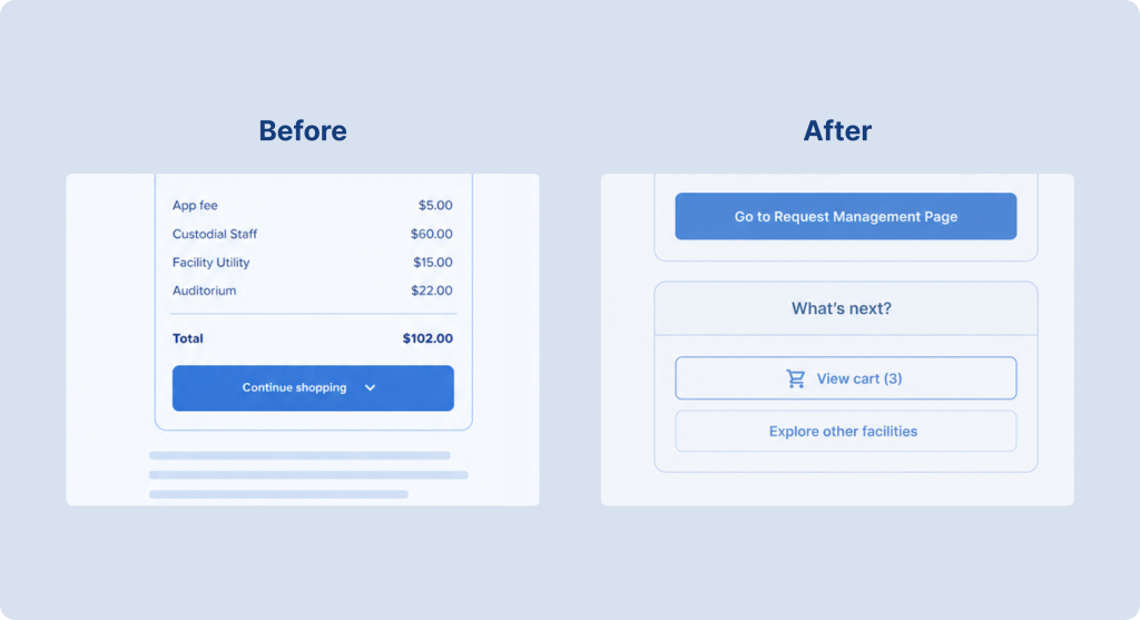
The old page kept the full fee breakdown on screen even though users had approved it at checkout. The detail added height and noise exactly when people wanted reassurance and a clear next move.
So we collapsed it. The total stayed visible, and the line items moved behind a “See breakdown” toggle.
This one needed care. Hide financial detail too aggressively and you look like you’re burying something. Leave it fully exposed and it competes with the actions that matter after booking. The compromise: show the total, tuck away the detail, let people expand it on demand.
Deferring actions behind triggers and collapsing content raises a question we don’t skip: does the screen stay usable for keyboard and screen-reader users too? Our guide to European Accessibility Act compliance covers why that matters and what ignoring it can cost.
Decision 3: stop hiding the next steps
The old page had a single “Continue shopping” button with a dropdown concealing everything else, so users had to realize other options existed before they could use them.
We pulled those options into their own buttons: go to request management, browse other facilities, book again. Nothing left to guess at.
This mattered most for repeat users managing several reservations or booking again immediately. Post-conversion navigation isn’t an afterthought. It’s a decision point that determines whether someone keeps using the product or wanders off.
How we measured it
We didn’t ship and walk away. Before launch, we ran user testing and surveys to check whether the new structure made sense. Could people tell what to do, did the concept land.
After launch, we tracked behavior. One caveat on the figures below: the first-week numbers come from a single week of traffic, so we read them as an early signal rather than a settled result. A one-week window carries novelty effects and day-of-week mix that a longer window smooths out, which is why we kept measuring for three more weeks.
First-week movement against the previous design:
- Bounce rate dropped from 59% to 36.24%
- Time to complete fell from 50.71 seconds to 29.66 seconds
- Clicks into request management jumped from around 5.6% to 29.7%
- Error rate dropped from about 4.2% to 2.5%
The surfaced navigation buttons were the clearest win. Replacing a hidden dropdown with visible options moved far more people into request management. The collapsed fee breakdown did what we hoped too: users reached the important content faster, and a low expand rate confirmed most didn’t need to revisit pricing after checkout.
Where the data pushed back
Good data doesn’t only confirm the plan. Two actions moved the wrong way, and how we were measuring them at launch is part of the story.
We tracked the two on different measures, which made them harder to compare than they should have been. For Add comment we watched reach: the share of sessions that included a comment. For Upload document we watched completion: the share of people who started an upload and finished it. Both moved the wrong way after launch:
- Add comment: the share of sessions leaving a comment dropped from 24% to 9%
- Upload document: completion fell from 85% to 70%, and took longer
Two different denominators for two similar actions is a measurement gap, not a design result, so we closed it for the follow-up. Going forward we tracked both reach and completion for each action. That distinction matters because they can move independently. Deferring an action behind a trigger can hurt how many people find it (reach) even while the people who do find it still finish reliably (completion). Cutting visual noise likely made these two actions too easy to miss for the people who needed them, and separating the two measures was the only way to confirm that.
Three weeks later
With both measures in place, the two actions told different stories.
Add comment recovered and then improved.
More people started it each week (135, then 173, then 179 users). Task completion climbed every single week – 90.37%, then 91.91%, then 93.30%. Completion time fell as well, from 55.41s to 47.31s. More people found the action, more finished, and faster. To confirm that reach is fully back to its pre-redesign share, we still want the session-level totals across the same window, but on both measures we can track, the direction is clean.
Upload document told a slower story.
Completion crept up week over week (70.48%, 72.36%, 73.43%), real progress but still short of the 85.28% baseline. Time moved the wrong way, from 45.62 s to 49.97 s. People are getting there more often, just not yet as fast as before. It’s recovering, not solved.
Side by side, the two make a useful pair. One action fully bounced back. The other is climbing slowly and needs another pass.
What's next for upload
The upload trigger is the open item, and the next-round hypothesis is specific: the trigger sits too low on the page and reads too passively. We’ll test two changes against the current baseline: moving the trigger above the fee summary, and rewriting the label from a generic “Select” to one that names the task, “Upload document.” Then we compare reach and completion against this baseline. If reach climbs and completion holds, that confirms the problem was visibility, not the deferred pattern itself.
What this says about product design
The lesson isn’t about confirmation pages. It’s that “small” screens carry weight when you look closely: hidden friction, unclear intent, decisions nobody questioned because the page seemed simple.
A confirmation screen looks minor. For the person on the other end, it’s often the moment they’re looking for reassurance and a next move. Design it well and you reduce drop-off, add clarity, and reopen the door to re-engagement, with numbers to show it.
The kind of iteration this case describes takes real hours, so we keep the process lean where we can. Here’s how our designers use AI tools to work more efficiently without cutting corners on the thinking.
There’s no perfect solution here. We design for people, not systems, and people don’t always behave the way the logic predicts. What we can do is form a reasonable hypothesis, ship it, and stay close to the data afterward. Add comment recovered past where it started. Upload is still catching up. Neither outcome was guaranteed. That’s the actual work: not getting it right on the first try, but staying close enough to know when it’s working and when it still needs a hand.
Take a closer look at a screen in your product
Every product has a screen the team treats as “just functional.” A confirmation page, an empty state, an onboarding step. Those are often where quiet drop-off hides, and where a focused redesign pays back quickly.
We hypothesize, ship, measure — and tell you what worked and what didn’t. Same process we used in this case.

Lead UX/UI Designer
at Ralabs